


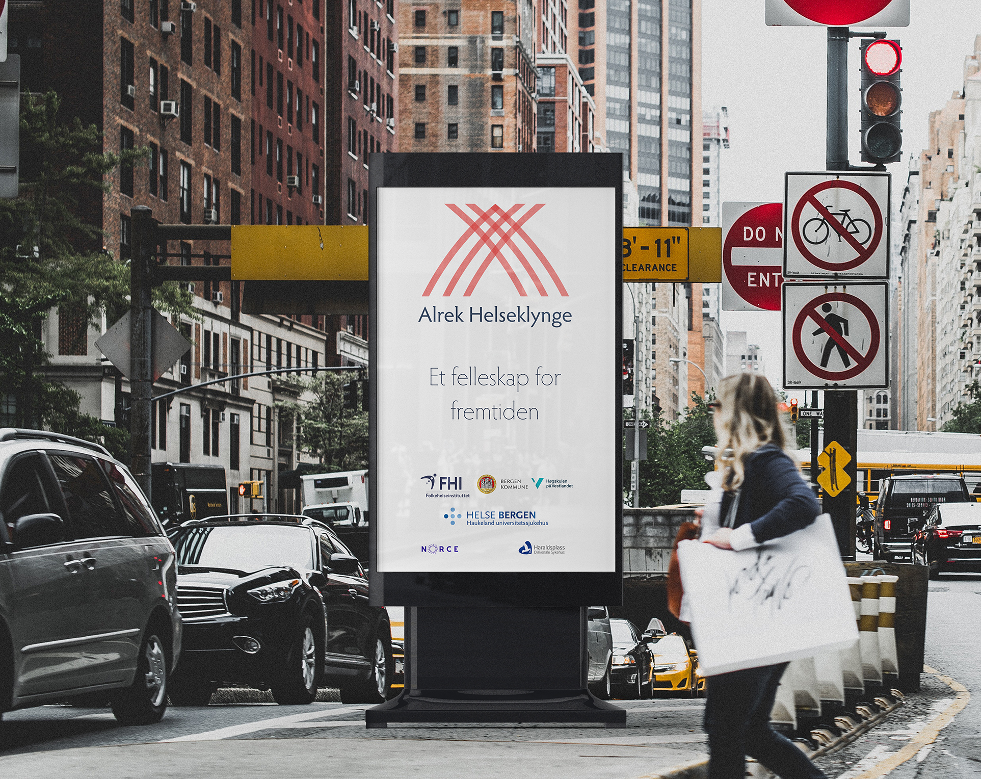
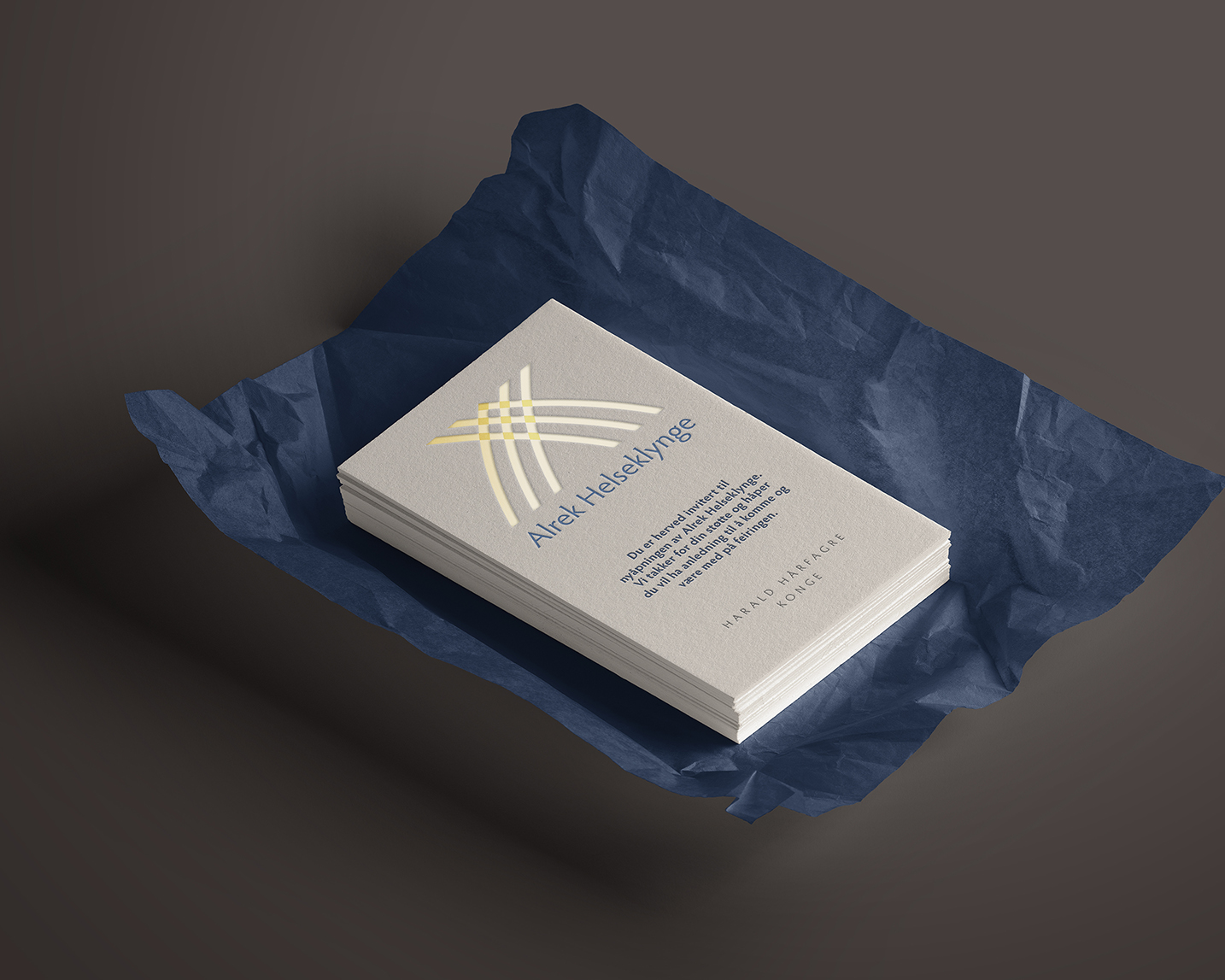
The Norwegian Health Cluster is a co-operative project with several investing organisations and groups. This was, by far, the largest and most interesting project I had worked on.
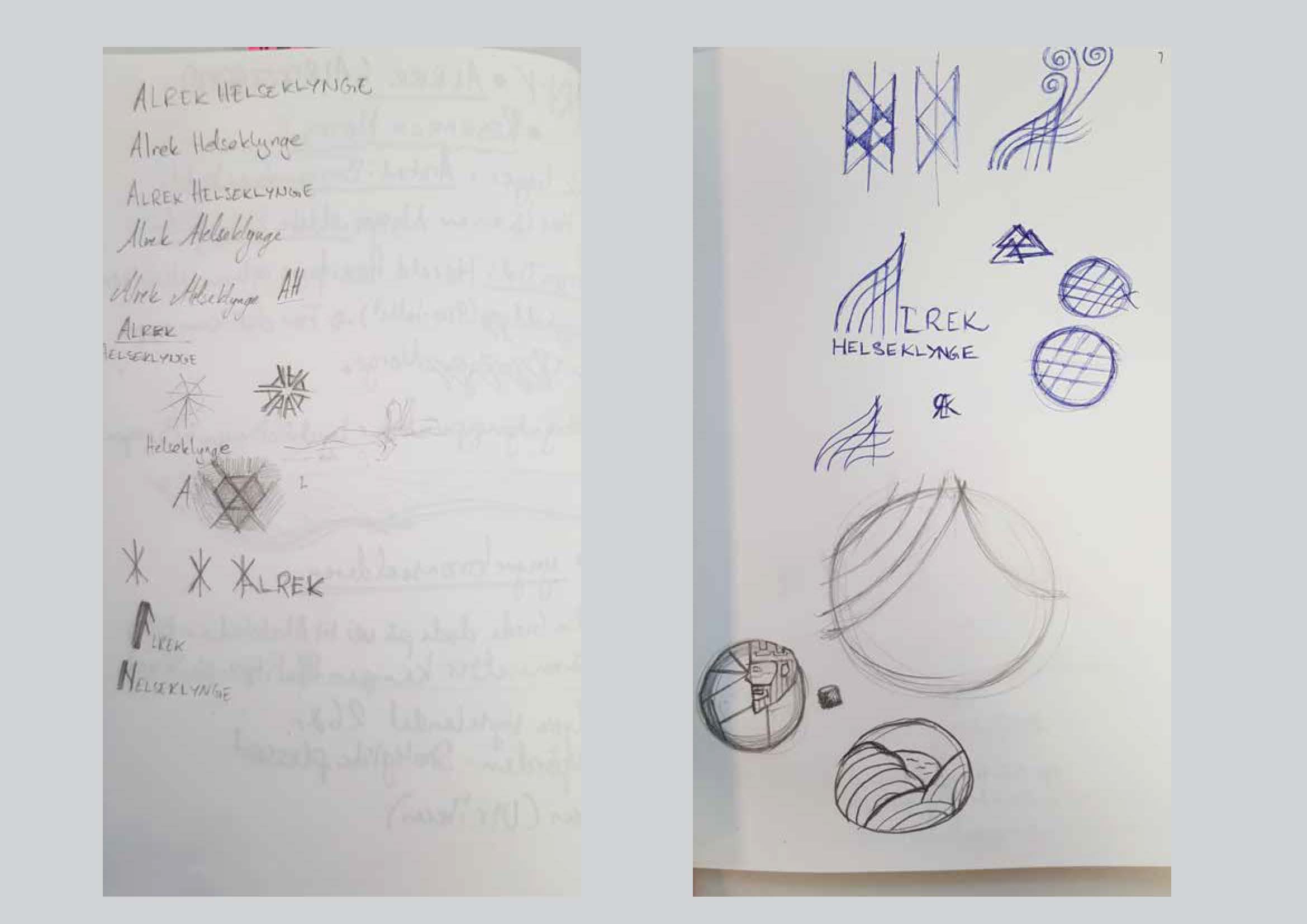
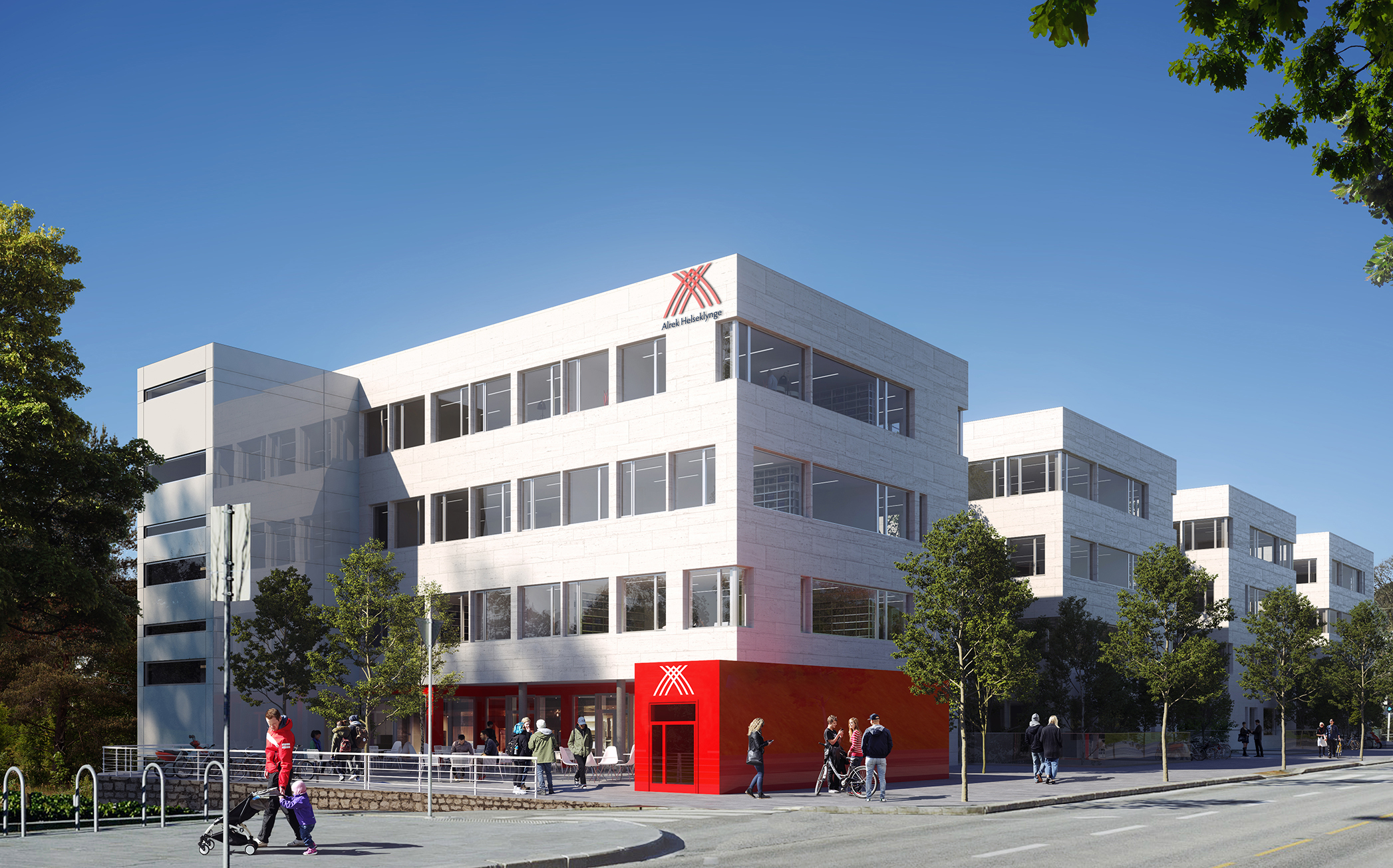
The name of the new cluster was to be Alrek helseklynge (Alrek Health Cluster). Alrek, being a name of Ulriken-mountain, from the early-bronze-age. It was a time of unification, as a nation was coming together in both culture, structure, language, religion/mythos, etc. Much like the health cluster itself. This needed to be embodied in the identity of the brand. Something that harked back to its historical roots, yet seemed modern and could stand the test of time.
I started to workshop with a team at the Medical Faculty (UiB), consisting of 3-4 people. Via this workshop we were able to nail key components and goals for the brand.
The brand then went through a thorough ideation process; with stylescapes, mood-boards, historical research, Norse mythology research and colour research of that era.
The solution posed to be difficult to solve, visually. So I got in touch with a Norwegian linguistics professor at the University of Bergen, and was able to figure out the meaning of the word Alrek. Suffice it to say, my mind was blown. And sketches I had previously made, had started falling into place. I went back to the drawing board and started refining my design.
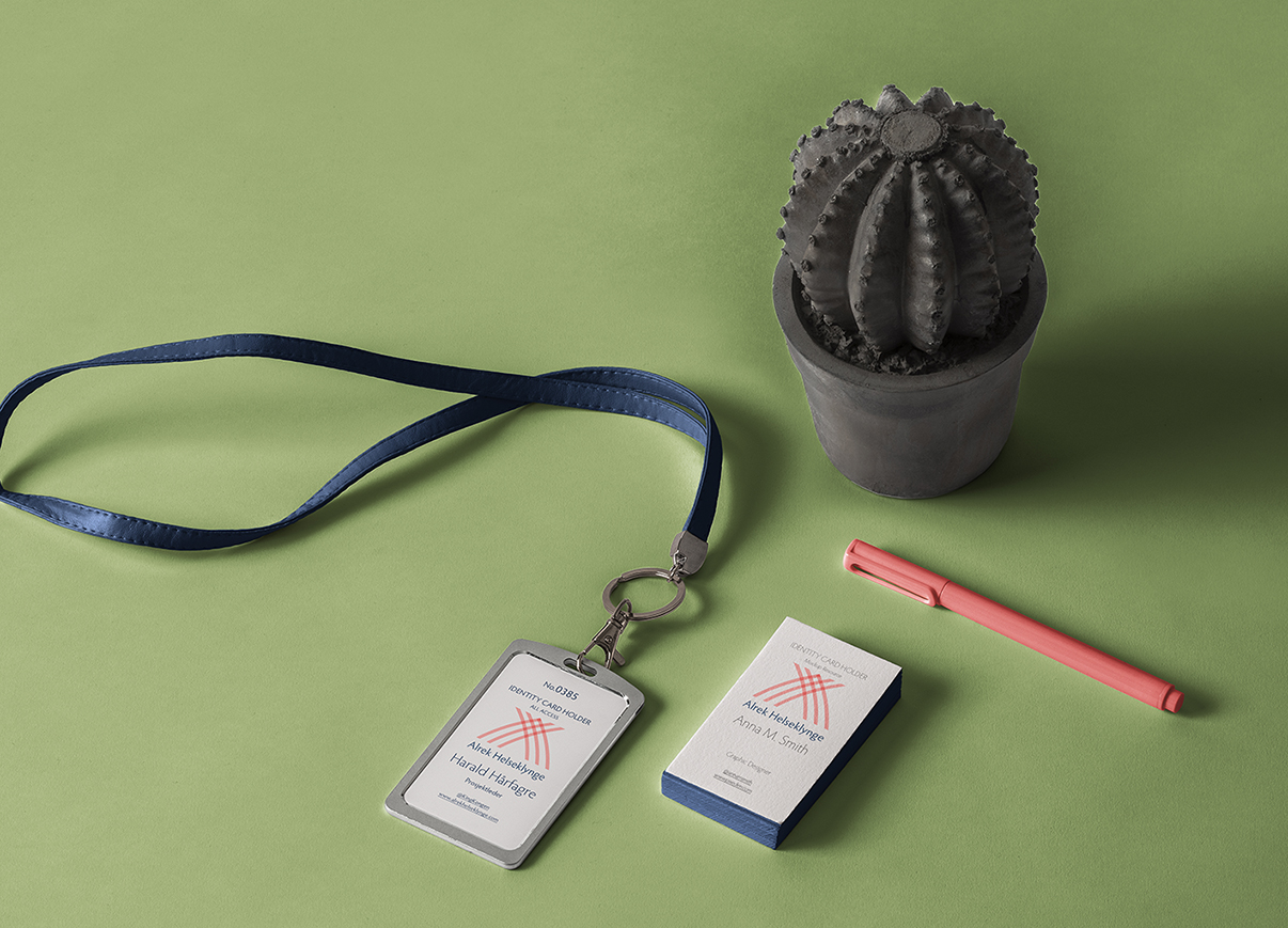
A timeless solution was found. One both I, and the city could be proud of.